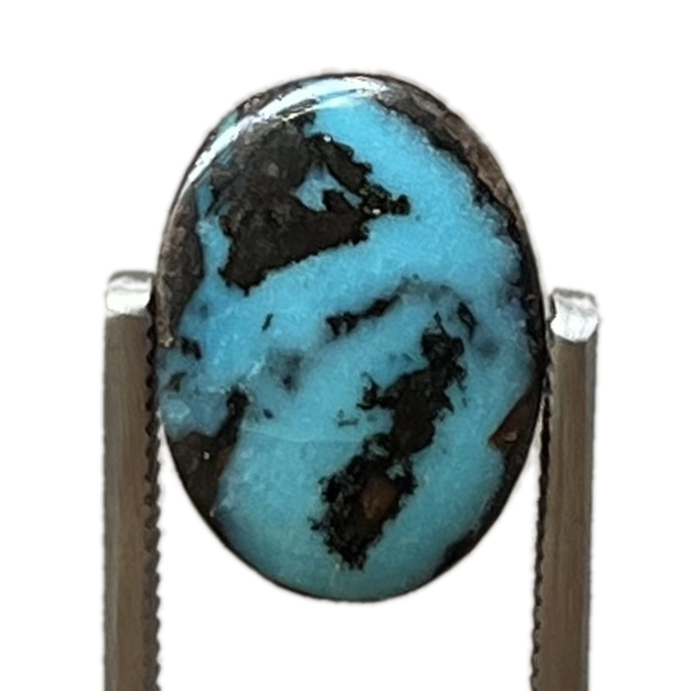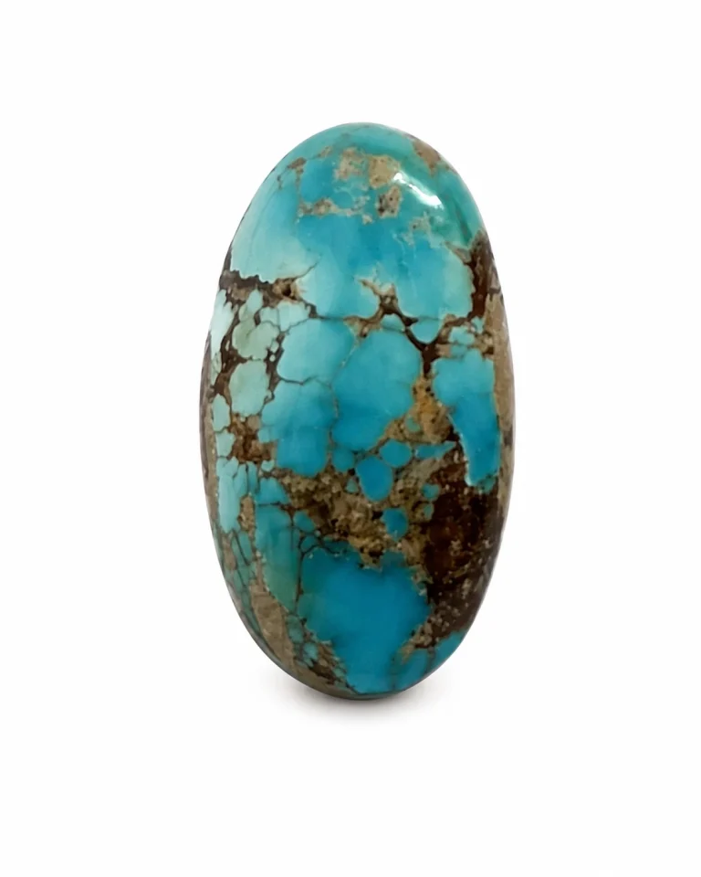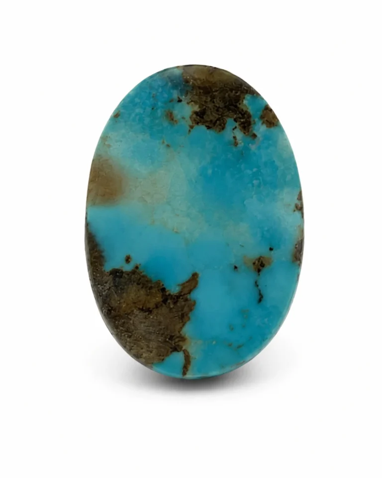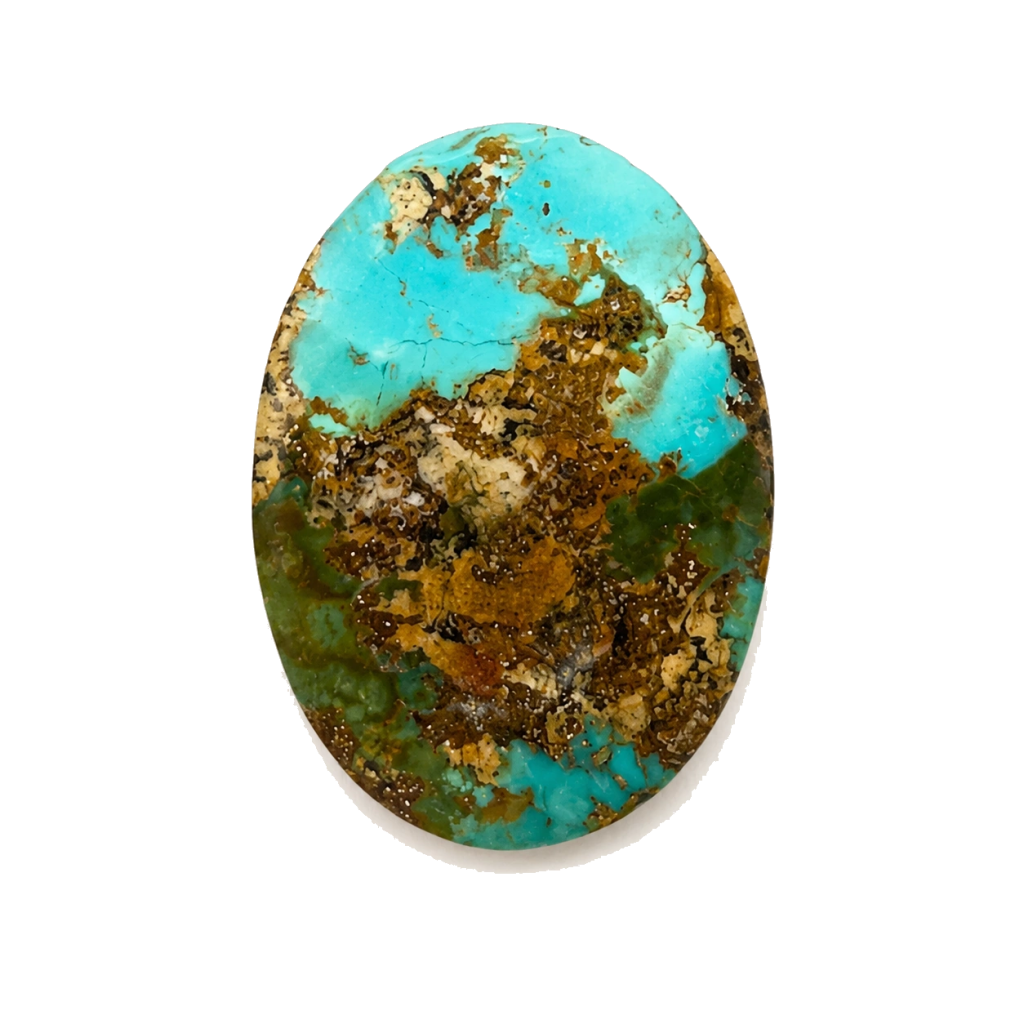
Turquoise is not one fixed colour. Depending on the stone and the documented description, it may be described along a blue-to-green range, with matrix, host rock or mineral zones adding another layer of visual character. The useful question is not simply “Is turquoise blue or green?” It is: what colour direction is recorded for this individual stone, and how does its matrix change the way the surface reads?
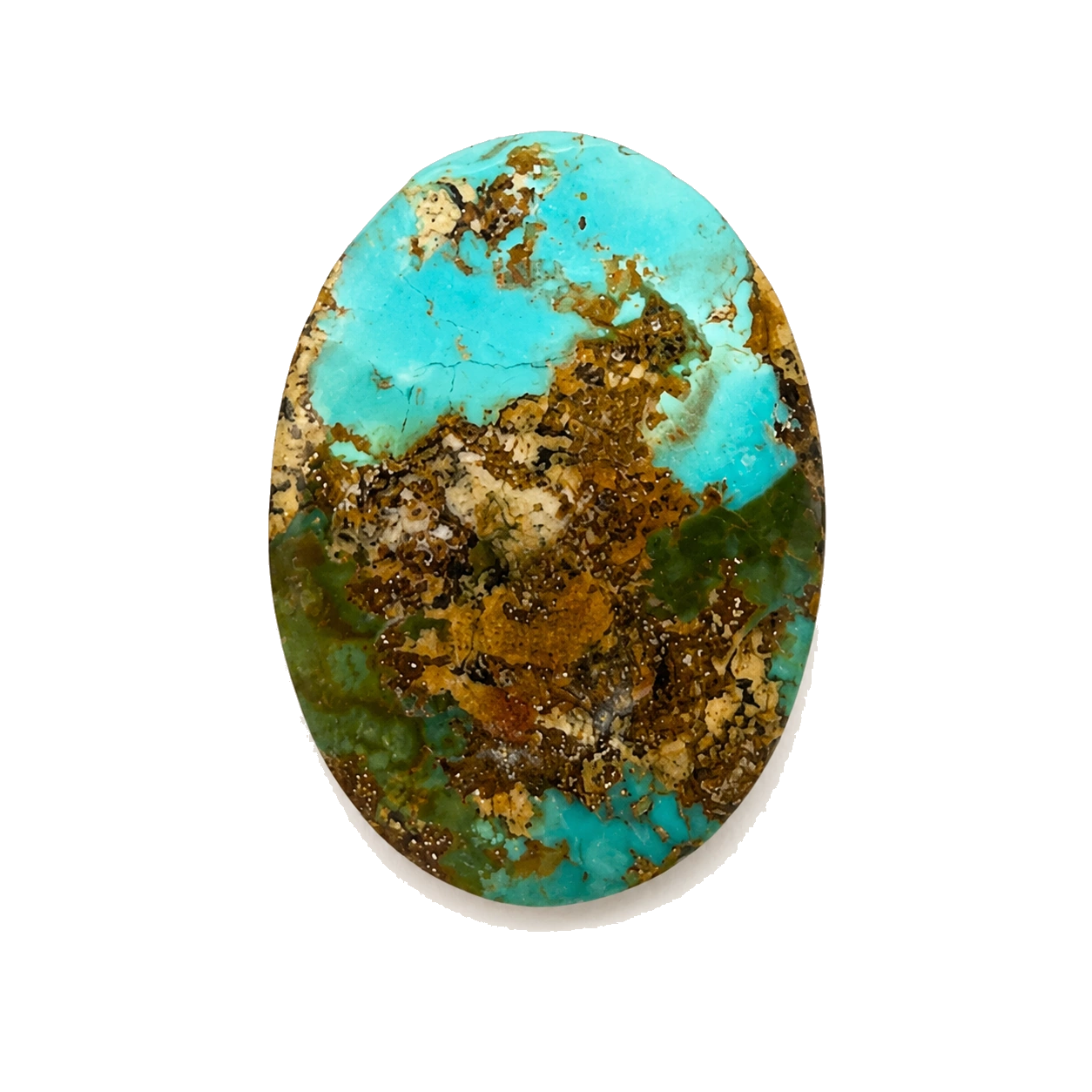
What colour is turquoise?
In everyday language, turquoise usually refers to a colour between blue and green. In a one-of-one stone, however, the public description should remain tied to the individual record. A catalogue photograph is useful for first orientation, but it should not replace the product facts, measurements, treatment statement or the full image set.
At NEYFI, colour direction is treated as one part of a stone’s identity. It sits beside form, scale, matrix, profile and documentary imagery. That keeps the description specific without pretending that a single colour word can explain the whole stone.
Blue turquoise, green turquoise and the blue–green range
Some turquoise is described with a blue direction; some is described with a green direction; and some sits within a wider blue–green range. These words are not a promise that every screen, light source or photograph will reproduce the same appearance. They are a concise way to communicate the recorded visual direction of the individual stone.
When comparing two stones, read their records side by side. Confirm the colour field first, then look at the images, matrix description and dimensions. Do not assume that a deeper or brighter screen image proves a different mineral composition, treatment or value.
Why matrix changes the way colour reads
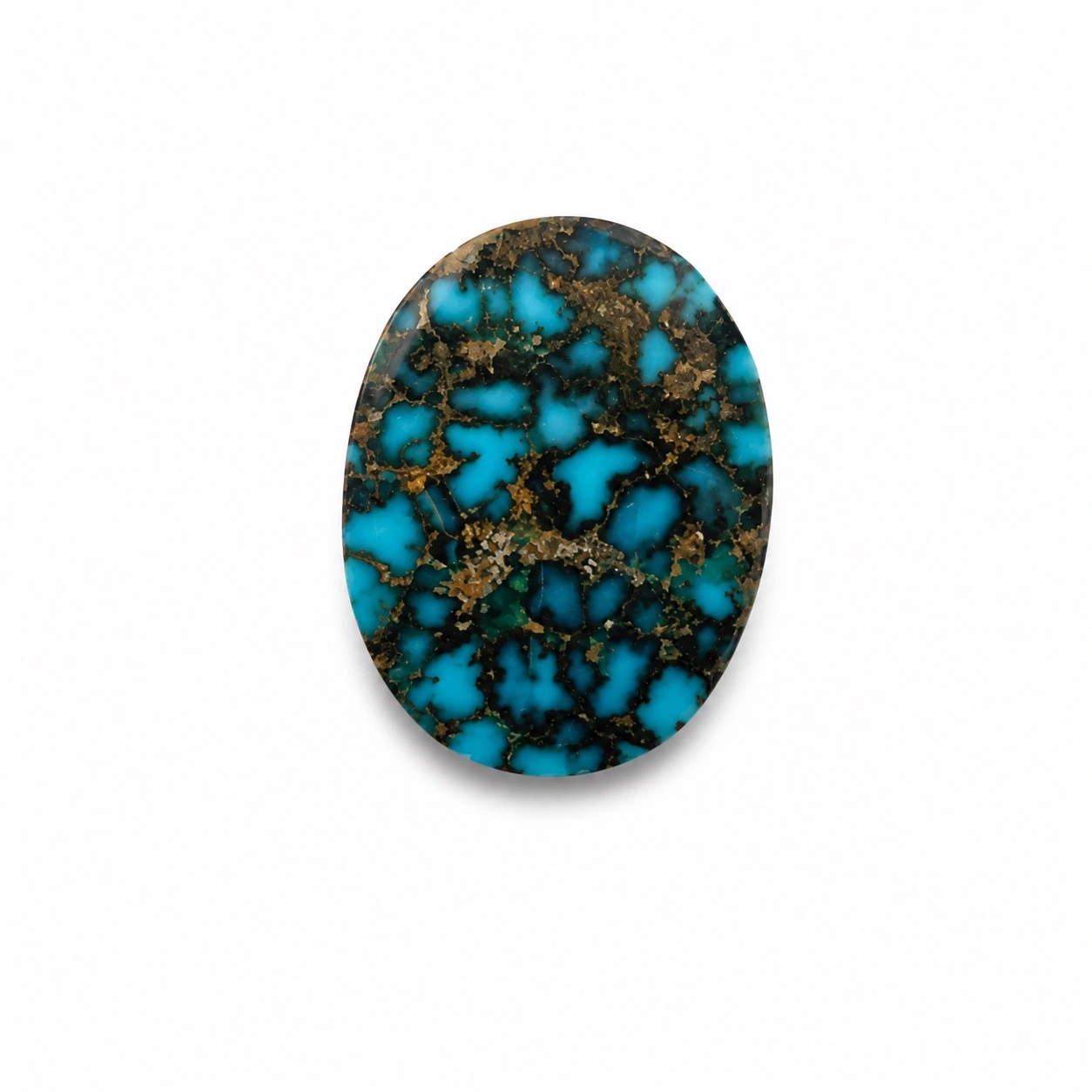
Matrix is the material, pattern or host-rock character that appears with the turquoise in the documented stone. Spiderweb, mosaic, brecciated and host-rock descriptions can make the same broad colour family feel more structured, contrasted or varied.
Matrix is not a defect to be hidden and it is not a reason to invent rarity language. It is part of the object’s visible identity when it is recorded and shown honestly. For a collector or jewellery designer, the practical question is whether the matrix works with the intended setting, surrounding material and visual direction of the project.
How to compare turquoise colour responsibly
- Start with the Stone ID. Make sure every image and fact belongs to the same individual stone.
- Read the recorded colour direction. Treat it as the documented description, not as a promise about every display or light source.
- Read the matrix field separately. Matrix can change contrast and visual rhythm without being the same thing as the base colour.
- Review more than one view. Front, reverse, profile and hand-scale images answer different questions.
- Check scale and setting context. Dimensions, dome and thickness matter when the stone is being considered for jewellery.
- Confirm current EUR price and delivery context. Availability and destination eligibility belong to the live product and order context.
Does green turquoise have less value than blue turquoise?
There is no truthful universal answer. A stone should not be ranked from one colour word alone. The individual record, surface, matrix, form, dimensions, treatment statement, provenance context and the buyer’s intended use all matter. Collectors may prefer one direction; a designer may need another for a particular setting.
The strongest choice is the stone that fits the project and can be understood clearly before purchase. That is why NEYFI presents one-of-one stones through a product record rather than reducing the selection to a generic colour filter.
Use the record, then choose the stone
To browse current documented stones, visit the NEYFI Collections. For a specific project, use Professional Sourcing and include the preferred colour direction, matrix character, approximate dimensions and destination where relevant.
For a close look at another documented example, see NEYFI 1015. The product page keeps the Stone ID, measurements, recorded description, EUR price and current availability together.
From the field notes
See the stones behind the material.
A field note is the beginning. Compare individual Neyshabur stones with their own documentary images, Stone IDs and EUR availability.